

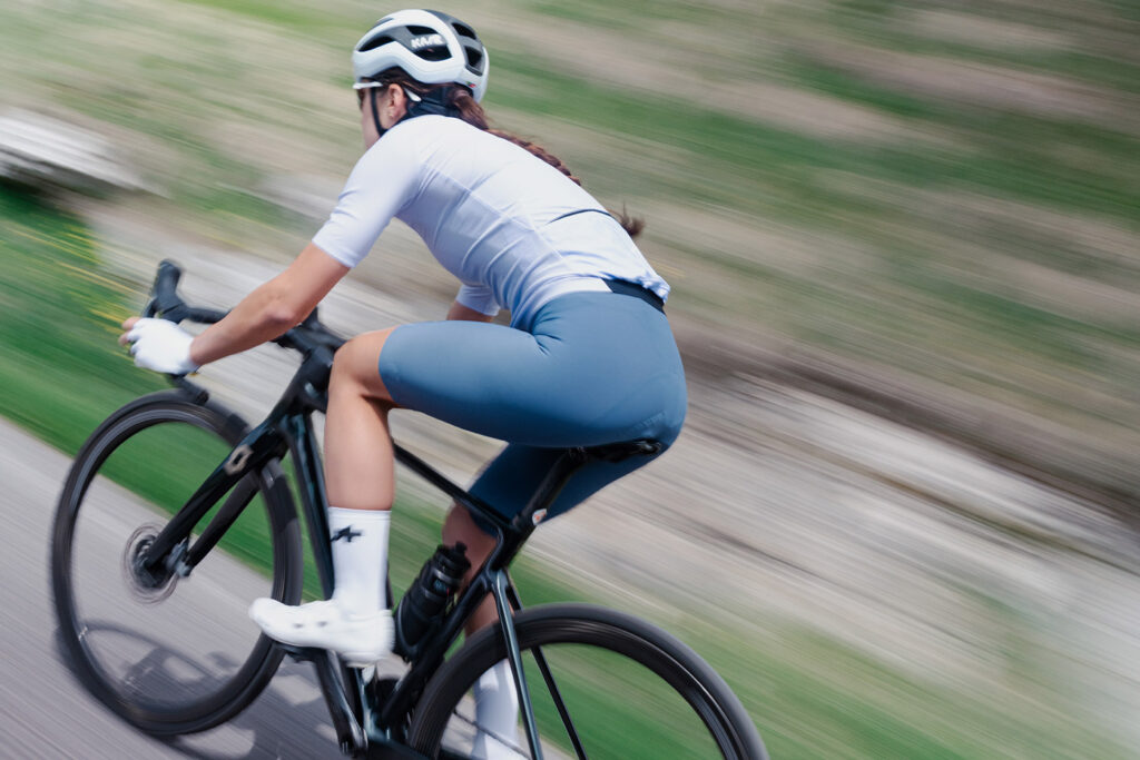
Color in a cycling kit is never just an aesthetic choice.
When we choose a cycling jersey, bib short, or pair of cycling shorts, color helps define how we perceive the product: more technical, more natural, more racing-oriented, more outdoor-inspired, more refined, or more connected to travel and exploration.
But in cycling apparel, color is not only about what is visible from the outside.
Even a hidden component like the cycling chamois can contribute to the overall identity of the garment. It works inside the short, in direct contact with the body, where comfort, materials, construction, and performance become a real riding experience.
For Elastic Interface®, color research is not decoration. It is part of the design process: a way to connect technical performance, visual identity, and the perception of comfort.
Color becomes a language of performance. Even where it cannot be seen.
Why color matters in cycling apparel.
For years, cycling apparel was dominated by highly recognizable codes: black, team colors, racing graphics, high-visibility tones, and technical palettes.
Today, the market is much broader. Cycling is no longer only about competition. It is road, gravel, bikepacking, touring, off-road, community, travel, and technical lifestyle. Each discipline has developed its own visual language, and color has become a powerful way to express it.
A road cycling kit can communicate precision and speed.
A gravel kit can express freedom, personality, and outdoor culture.
A touring garment can evoke durability, comfort, and immersion in the landscape.
Choosing a color means choosing an identity. It is not only about “what I wear,” but also about “how I want to experience and tell my ride.”
The chamois: a hidden detail that shapes product identity.
The cycling chamois is not visible when the garment is worn. Yet it is one of the most important elements of a cycling short or bib short.
It is the point where the body meets the saddle. This is where comfort, materials, construction, and performance come into direct contact with the rider.
The color of the chamois can also become part of the design. Not because it needs to be shown, but because it contributes to the overall coherence of the garment: how it is conceived, positioned, and remembered.
A chamois designed for a road garment can align with a clean, technical palette.
A chamois for gravel can connect with a more personal, outdoor-inspired identity.
A chamois for touring can reinforce a sense of comfort, durability, and depth.
In cycling apparel, even what remains hidden can create value.
From high summer to early fall color palettes.
August is a month of transition.
Rides still carry the rhythm of summer, but the light begins to change. The days remain long, yet colors become deeper. The landscape gradually shifts from brighter tones to more natural, textured, and warmer palettes.
Cycling apparel follows the same movement.
The most interesting color trends are not always the loudest. Often, they are the ones that help a garment feel more consistent with its purpose: more technical for road cycling, more sophisticated for gravel, more natural for off-road, warmer and deeper for touring.
From this transition between summer and early fall, four color directions emerge: Future Gray, Mauve, Verde Foresta, and Cocoa Powder.
Future Gray: technical precision for road cycling.
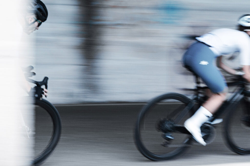
In road cycling, everything speaks to efficiency.
The position is more aerodynamic. The movement is repetitive. The rhythm is constant. The product needs to communicate lightness, precision, speed, and control.
Future Gray interprets this world with a clean, technical, and contemporary tone. It is cool, essential, and future-oriented. It does not seek attention aggressively; instead, it communicates performance through visual clarity.
In a road cycling kit, technical gray can convey:
| Attribute | Meaning |
| Precision | A clean and controlled visual identity |
| Innovation | A forward-looking performance language |
| Freshness | A modern and essential appearance |
| Minimalism | Reduced visual noise |
| Reliability | Technical confidence and consistency |
It is an ideal color for riders looking for modern, refined, performance-driven cycling apparel, where every detail feels designed to work better.
In the Elastic Interface® language, Future Gray becomes a visual code for the road: technical, essential, and built around the idea of clean performance. Even in the chamois, this color direction can reinforce the perception of a precise, advanced product developed for road cycling.
Mauve: a new identity for gravel.
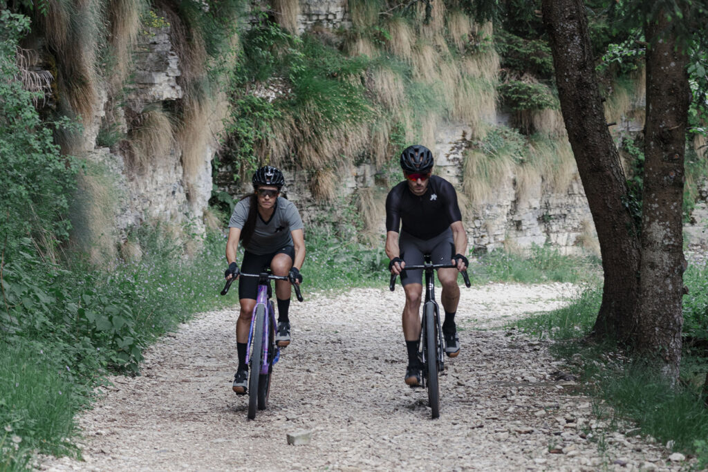
Gravel has changed the way we look at cycling apparel.
It has introduced an aesthetic that is less rigid than traditional racing codes. More personal. More free. More connected to nature, yet also more sophisticated.
Mauve represents this evolution well.
It is not a typical racing color. It is not aggressive. It is soft, deep, and contemporary. It carries an outdoor sensitivity while maintaining a refined character. This makes it especially relevant for gravel: a discipline where performance, personal identity, and freedom of exploration coexist.
In a gravel cycling kit, Mauve can communicate:
| Attribute | Meaning |
| Personality | A more individual approach to cycling style |
| Technical elegance | Performance with visual refinement |
| Freedom | A less codified riding culture |
| Community | A shared but personal way to ride |
| Outdoor sophistication | Nature-inspired, but elevated |
This is a color for riders who are not only looking for performance, but also for a product that expresses a different way of experiencing the bike.
Gravel is no longer only about dust, effort, and uneven terrain. It is also style, connection, discovery, and identity. Mauve captures this change in perspective.
The chamois can also connect with this world: not as a decorative detail, but as part of a product designed for riders who want technical comfort and personal identity in the same garment.
Verde Foresta: timeless outdoor performance.
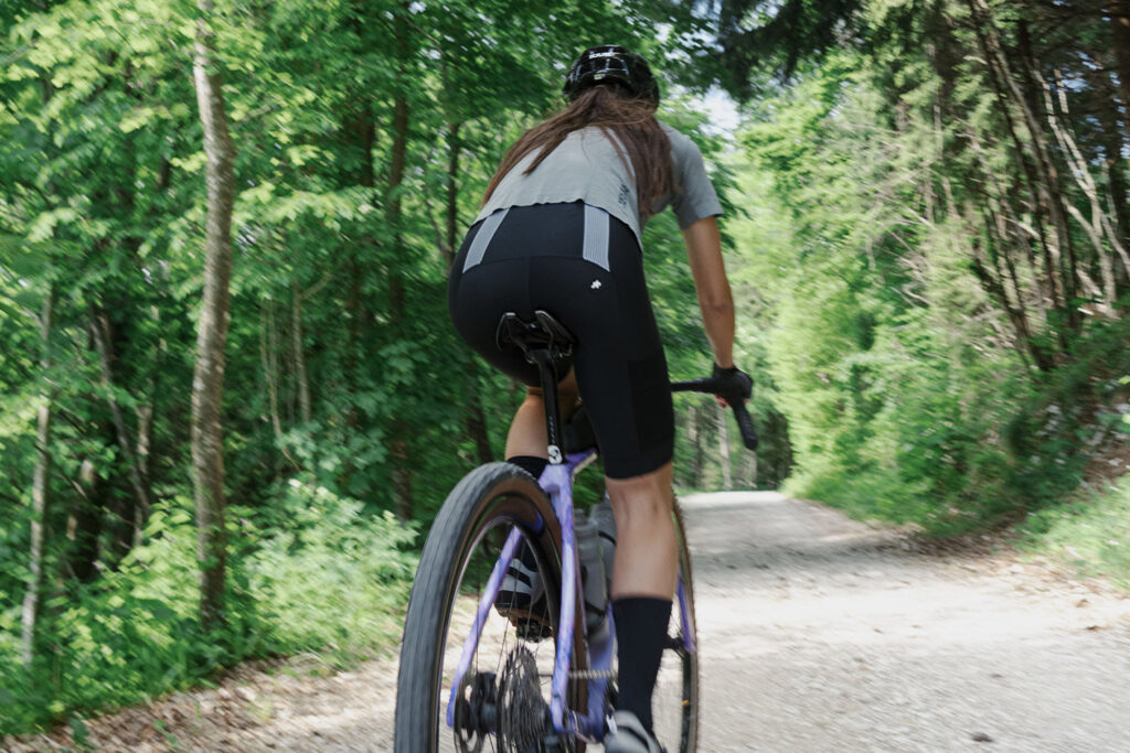
Some colors do not belong to one season only.
Verde Foresta is one of them. It is deep, natural, and recognizable. It immediately connects to the outdoor world, trails, woods, long off-road rides, and touring experiences.
In cycling apparel, green is a strong color direction because it communicates continuity with the environment. It is not simply a “nature color.” It suggests durability, stability, and reliability.
For off-road, gravel, and touring, Forest Green can communicate:
| Attribute | Meaning |
| Connection with the environment | A visual link to outdoor landscapes |
| Resistance | A sense of durability and strength |
| Exploration | Freedom beyond paved roads |
| Solidity | Stability and confidence |
| Long-lasting comfort | A product built for time in the saddle |
It is an ideal tone for riders looking for a kit that is less tied to short-term seasonal trends and more connected to a lasting outdoor identity.
In this sense, Forest Green is a natural bridge between late summer and early fall: it maintains the connection with the outdoors while introducing a deeper, more grounded quality.
In the chamois, a color direction like this can strengthen the coherence of products designed for outdoor experiences, where comfort, reliability, and durability become part of the same promise.
Cocoa Powder: comfort with depth.
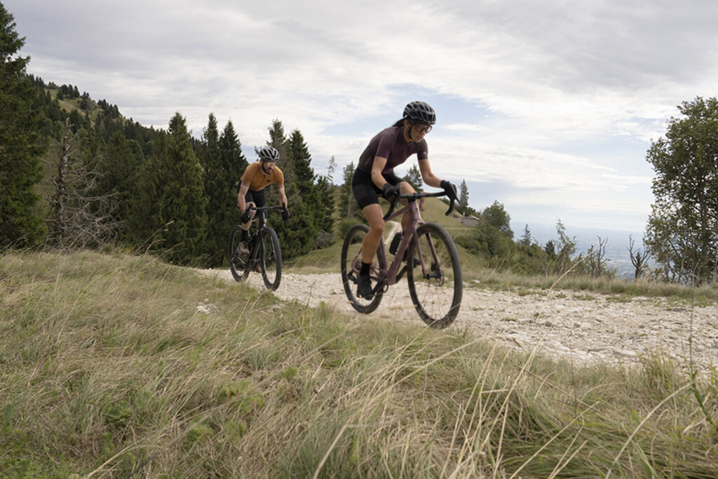
Toward the end of summer, the rhythm changes.
Rides become slower, longer, and more immersive. The light grows warmer. The landscapes become softer. Color can follow this feeling.
Cocoa Powder interprets the shift toward early fall with a warm, deep, and textured tone.
It works particularly well for touring and comfort-oriented products. It does not communicate immediate speed, but duration. It does not speak of aggressive performance, but of experience. It suggests travel, stability, warmth, and the pleasure of time in the saddle.
In a touring cycling kit, Cocoa Powder can communicate:
| Attribute | Meaning |
| Comfort | A softer, more welcoming perception |
| Durability | A product designed for long rides |
| Naturalness | A warm connection with the landscape |
| Depth | A more textured visual identity |
| Technical lifestyle | Performance with an everyday outdoor feel |
It is a color choice for riders who see cycling as slow exploration, time outdoors, travel, and not only training.
Applied to the world of the chamois, Cocoa Powder can reinforce a warmer, deeper perception of comfort: comfort designed to last, support movement, and remain present through long days in the saddle.
How to choose cycling kit colors by discipline.
There is no single right color for everyone. There is a color that feels consistent with how you ride, the discipline you practice, and the identity you want to express.
| Discipline | Color Direction | What It Communicates | How It Connects With the Chamois |
| Road | Future Gray | Precision, innovation, technical performance | Reinforces a clean, technical, performance-focused perception |
| Gravel | Mauve | Personal identity, outdoor elegance, freedom | Connects to a more distinctive, personal, outdoor-inspired world |
| Off-road / Touring | Forest Green | Nature, durability, exploration | Supports a natural, solid, and lasting visual identity |
| Touring / Late summer | Cocoa Powder | Comfort, depth, travel, warmth | Reinforces the perception of comfort, durability, and technical lifestyle |
For riders, this perspective can make kit selection easier. Color should not be chosen only because it “looks good,” but because it expresses the kind of experience we want to live.
Road riders may prefer cleaner, more technical palettes.
Gravel riders may look for more personal and less codified colors.
Touring and off-road riders may choose deeper, more natural tones.
Riders focused on comfort and long days in the saddle may move toward warm, textured, and less aggressive colors.
Color, comfort, and performance work together.
In cycling apparel, value comes from balance.
A kit needs to look good, but it also needs to be functional. It must communicate identity, while supporting performance. It should feel consistent with the rider and with the type of ride.
Color helps build this perception. But color alone is not enough.
It needs to work with materials, fit, construction, the chamois, and the rider’s overall experience. When all these elements work together, the garment becomes more than a technical product: it becomes part of the way the rider experiences the bike.
This is where color becomes a language of performance.
It does not simply add style.
It helps express comfort, discipline, identity, and belonging.
The color of the chamois is part of the design.
For Elastic Interface®, the chamois is not just a hidden accessory inside the short. It is a technical component that contributes to the quality of the garment and to the perception of comfort.
Its main function always remains the same: to support the rider where the body meets the saddle through materials, construction, ergonomics, and performance.
But color can also play a role.
It can help a brand create a more coherent collection. It can strengthen product positioning. It can transform a technical component into a recognizable detail, even when it remains inside the garment.
In cycling, every millimeter matters.
Even the ones you cannot see.
FAQ
What are the main color trends in cycling apparel?
The most relevant cycling apparel color trends move between clean, technical tones for road cycling, more personal palettes for gravel, natural colors for off-road and touring, and warmer shades for the transition between summer and fall.
How should I choose the color of a cycling kit?
The color of a cycling kit can be chosen according to the riding discipline, personal style, and product identity. Road cyclists may prefer technical and minimal tones, while gravel and touring allow for more natural, sophisticated, or textured palettes.
Is the color of the cycling chamois important?
Even though the chamois is hidden inside the garment, its color can contribute to the overall coherence of the product. For brands, it is a detail that can reinforce identity, positioning, and recognition.
What colors work well for gravel cycling?
Natural, sophisticated, and personal colors work especially well for gravel cycling. Mauve, deep greens, warm browns, and outdoor-inspired tones communicate freedom, identity, and connection with the landscape.
What colors should I choose for a touring cycling kit?
For touring, warm, deep, and natural palettes are particularly effective because they communicate comfort, durability, and travel. Cocoa Powder and Forest Green are two examples of tones that align well with this type of riding experience.
Because many of the color trends described in this article accompany the transition from summer to early fall, it may also be useful to explore the topic of thesummer cycling chamois, designed to offer comfort and breathability during rides in the warmest months.